If you want your printed designs to look amazing, use these steps as a guide before sending your design to be professionally printed. This will help ensure there are no errors in the final product. In this article I will tell you how to match paint color to fabrics.
Use CMYK Chart as Fabric Vendor
Have you ever wondered why the colors in your print design look different from the colors on your screen? If you’ve ever had this experience, you’re not alone. While it may seem like a small thing, color is actually a very important part of any design, and getting it right can be tricky. Here’s a quick overview of some of the reasons why colors can look different in print and on screen.
The first reason has to do with the way our eyes perceive color. Our eyes receive light waves and turn them into electrical signals that our brains interpret as color. The visible light spectrum contains all the colors we can see, from red to violet. But when it comes to screens, not all colors are created equal.
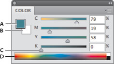
Most screens emit what’s known as “additive” light, which means that they create color by combining different intensities of red, green, and blue light (RGB). On the other hand, printed materials reflect light from their surface, so they use a “subtractive” process where different combinations of cyan, magenta, yellow, and black ink (CMYK) are used to create different colors. That’s why we often refer to these two processes as “RGB printing” and “CMYK printing.”
The second reason has to do with the device you’re using to view your designs. Different devices use different color models to produce color, and each model uses a different range of color values. The three most common models are sRGB, Adobe RGB, and CMYK. Most computers and phones use the sRGB color model, while most printers use the CMYK color model. And while Adobe RGB covers a larger range of possible colors than either sRGB or CMYK, it’s not as commonly used because it can’t be accurately reproduced on most devices.
The third reason is that printed materials are made up of tiny dots of ink, while digital designs are made up of tiny pixels of light. When ink is printed on paper, the dots blend together to form a solid area of color. But when pixels are viewed on a screen, they remain separate from one another so we can see the individual pixels that make up an image. This difference is known as “dot gain” or “halftone screening,” and it can cause printed colors to appear darker and more saturated than they do on screen.
When it comes to choosing paint colors, there are a few things to keep in mind. If you’re trying to match a paint color to fabric, the first thing you need to do is figure out what CMYK values represent the colors you want to match. Once you have those values, you can use a variety of online tools to find paint colors that match. You can also ask your vendor for help in finding the right paint colors. They should be able to match the fabric color pretty closely.
Use the Color Swatches From The Fabric Vendor
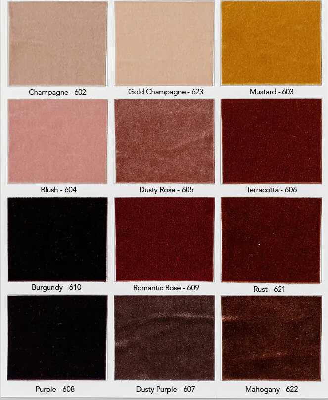
When you’re trying to match paint colors to fabric, one of the best things you can do is to ask your vendor for color swatches. This way, you can hold the swatches up to the fabric and get a good idea of what will work best. You may also want to ask for a few different swatches so that you can test out different shades and tones. Once you’ve found a few colors that you like, it’s time to start testing them out. The best way to do this is to paint small squares of each color on a piece of scrap paper or cardboard. Then, hold the squares up to the fabric and see how they look. If possible, try to view the colors in both natural and artificial light. This will help you get a better sense of how the colors will look in different settings. Once you’ve found a few colors that you love, it’s time to start painting!
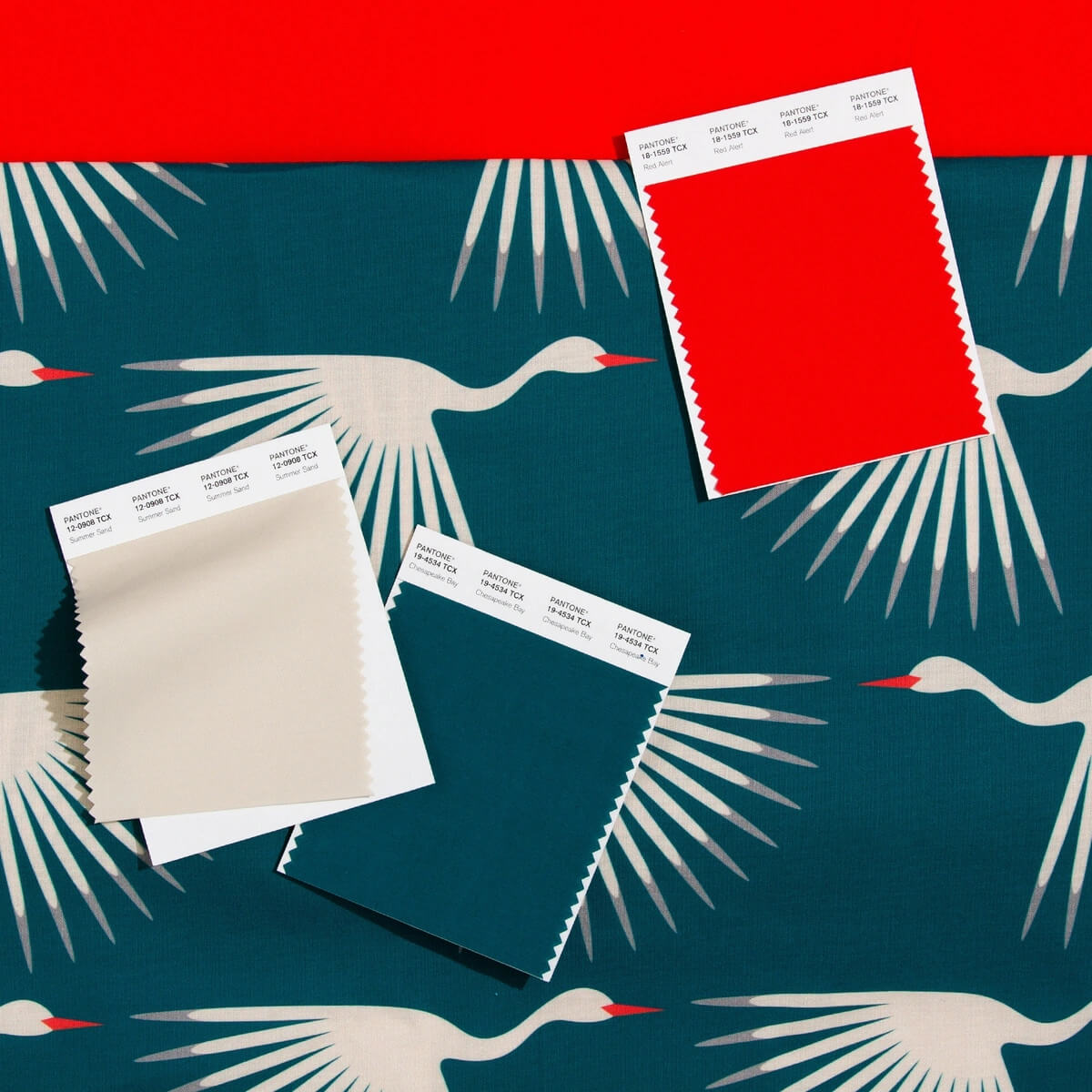
Pantone Becoming The Standard
If you’re like most people, you probably don’t think about painting very often. But for those in the design industry, paint is a vital part of the job. And when it comes to painting, there’s one company that is the standard bearer: Pantone.
Pantone is the world’s leading provider of color standards, and its products are used by designers in a variety of industries, from fashion to home decor. If you’re a designer, odds are you’ve used Pantone products at some point in your career.
But what happens when you need to match a paint color to the fabric? It can be a challenge, but luckily there are some tips and tricks you can use to make sure you get the perfect match.
First, it’s important to understand the differences between opaque, transparent, and translucent fabrics. Opaque fabrics will block all light, while transparent fabrics will allow light to pass through them. Translucent fabrics fall somewhere in between, allowing some light to pass through but not all of it.
Once you know what type of fabric you’re dealing with, you can start thinking about color. If you’re matching paint to an opaque fabric, you’ll want to choose a paint color that is similar to the fabric’s color. For transparent or translucent fabrics, you’ll want to choose a paint color that is darker than the fabric’s color.
You also need to consider the value of the colors you’re working with. Value refers to the darkness or lightness of a color. A dark color has a low value, while a light color has a high value. When matching paint to fabric, you’ll want to choose a paint color with a value that is similar to the fabric’s value.
Finally, it’s important to think about the undertone of the colors involved. Undertone refers to the underlying hue of a color. For example, red can have an undertone of orange or blue. When matching paint to fabric, you’ll want your chosen paint color to share a similar undertone as your selected piece of fabric . Keep these tips in mind, and you’ll be able to match paint to color fabric like a pro!
Conclusion
With these tips, you should be able to match paint colors to fabrics like a pro! If you’re still struggling, or if you want some expert help deciding which colors will work best in your home, contact us today. Our design team would love to assist you in creating a space that is both stylish and comfortable for you and your family.